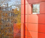
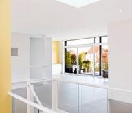
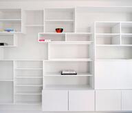
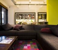
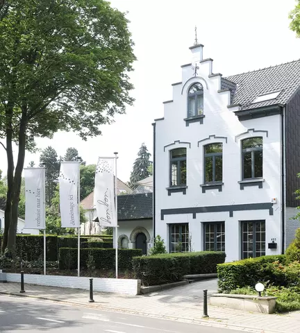
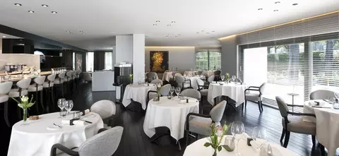
At first, we put in the skin of the head and his brigade. This crucial step allowed us to better understand the occupation of the kitchen and adjoining well as internal circulation system specific foodservice. Chef wanted to make her kitchen a true spectacle and thus put forward wrought products. Therefore, we quickly opted for a fully open and décor leaving the spotlight to the plate. We also played on the dichotomy between the kitchen and creating an architectural boundary between these two spaces. So we opted for a game decided in the colors: black and gray tones on the side of the room, shades of white and clear on the side of the kitchen. The different areas are also naturally separated by a line consisting of general-pass heating, bar and wall toilets. This arrangement emphasizes material perfectly frank passage between different spaces and atmospheres. Ceiling heights are still sharply differentiated mark the overall design. The arrangement allows the food to be visible everywhere, and inviting the entire culinary spectacle assistance. The choice of materials is both contemporary and Veterans also add to the splendor and luxury of this Michelin-starred restaurant in the capital.
- Typology
- Horeca
- Status
- Construit
- Year of conception
- 2011
- Year of delivery
- 2011
- Client
- Christophe Hardiquest
