- postsSite Internet
Published on 27/11/2015
entrer: Gigogne + L'Escaut - "Confrontations"
Image CopyrightFrançois Lichtle
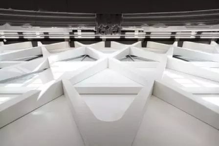
To convert the chapel of the Ursulines convent in Mons into the Artothèque, the architects of Atelier Gigogne + L'Escaut inserted a volume that bears witness to the present in a past that is taken into account but can no longer be changed.
In 1952 German architect Hans Döllgast was commissioned to renovate the Alte Pinakothek in Munich. Originally designed by Leo von Klenze in 1836 as the largest art museum of its time, it was heavily damaged by bombing in World War II. Döllgast refused to repair the edifice as expected from a classic restoration. His aim was to emphasize the importance of history without compromising: parts of the destroyed facade had to remain visible, a goal achieved by rebuilding them in brickwork alone and by omitting the finishing of the ochre-coloured plaster and the embellishments of the original facade. Through this simple yet stubborn gesture, the confrontation with history became so conspicuous that still today this building remains a striking object of study. Without much explanation one grasps, or imagines, that something happened to the building, something destructive that should not be forgotten. Döllgast's approach to monument preservation was controversial in its day but became widely appreciated over time. In the interior the architect kept up the provocative principle used outside and kept the walls barren where necessary, functionally restoring the grand staircase leading from the vestibule to the exhibition halls on the upper floor. Parting in two directions parallel to the outer facade, this staircase causes an inner elevation as well. The visitor moves between the two sober brick fronts before entering von Klenze's neoclassicist enfilade.
In converting the Ursulines convent into a place to show and conserve the local heritage of Mons, the Brussels-based Atelier Gigogne + L'Escaut did not have to deal with the same weight of history as Döllgast in the Alte Pinakothek. Though part of the complex was also bombed during WWII, the architects' assignment from 2013 for the conversion is situated directly in the chapel, which carried the traces of its age. The question of the approach to monument preservation, raised by Döllgast 60 years ago, is equally relevant here. In the Ursulines convent the architects were inevitably confronted with the decay of a 350-year-old building that evidently underwent some renovation for its survival. But in 2013 the building needed a radical rethink because of its programmatic change into a public storage place for the municipal heritage of Mons. In architecture there has been a growing tendency to keep parts of the original construction of an existing building. It is for instance discernible in such subtle renovations as Tate Britain by Caruso St John (completed in 2010) without touching the original and adding some silent contemporary elements most visible in the rotunda, or in the direct confrontation with history which David Chipperfield Architects opted for in the Neues Museum project in Berlin (completed in 2009).
The architects' approach to the Artothèque bears traces of this tendency as well. However, their intervention is much louder than the above. In Mons the chapel's interior has been filled with a new volume that houses the different storage spaces and an office floor. This volume occupies just over half the chapel's length, leaving room for a modest entrance area. In the width of the existing building the new volume maintains a physical distance from the eastern walls of the chapel. This distance, which the architects call a fault line, serves the whole circulation: a narrow, straight concrete staircase leads to the first level of the new volume and extends into a ramp reaching the spiral staircase at the back which connects the upper levels. On the ground floor, the fault line also ensures the horizontal circulation, enabling the visual connection to the storage of paintings and direct access into the sacristy. This is now the exhibition hall of the Virtual Artothèque, which displays the hidden face of this vast collection by using touchscreens covering the tops of the storage units. The architects acted here as the scenographers of a virtual space, organizing the artefacts in the simple furniture referring to those used in storage facilities and laboratories. The vertical display cases are used economically, housing many pieces which are explained on the touchscreens and can be viewed in detail. The management of the collection in this way is an important part of the project for the space available to the public is limited by the sacristy next to the nave of the chapel that already contains the new volume. Using the touchscreens to browse the collection, one is eager to see all the pieces since the interface is simple and efficient – an issue the architects took seriously, persuading the right programmer to create their virtual scenography.
In contrast to this almost insubstantial exhibition space, the new volume within the existing building has a powerful material presence. Bringing to mind Döllgast's elevation at the staircase of the Alte Pinakothek, the volume results in a dominant facade with a diamondshaped pattern created through V-shaped structural elements painted white which allude to the pilasters of the nave. The whole construction inclines towards the ceiling of the chapel and has very much its own presence, stubbornly confronting the old walls of the chapel as though it were its own grandchild. But this architectural presence is only perceptible when gazing upwards since the fault line limits the distance from which to see the facade in its totality. The rigid volume – in fact, a building in its own right – seems rather stuck in the old chapel, consciously contrasting with its envelope. Here the understanding prevails that what has been added is from the present while what exists from the past cannot be ignored but neither can it be adapted any longer. In this regard, Atelier Gigogne + L'Escaut have taken a very rational attitude to this project, putting the programme and its accessibility as the main issues to manage. The functions literally occupy the existing interior with this new volume instead of the old chapel being restored to its former glory and a harmless box being put in it. Only on the western side does this interior building integrate the wall of the chapel and allow its aged face to be part of the new interior. Old and new, finishing and infrastructure keep meeting in the most direct way, as with the spiral staircase at the rear end on the fourth level where the rough timber structure of the chapel's roof is fully exposed. At the same time, this staircase rises through the new volume in the same way as the staircase of the bell tower bordering the wall they share, clearly comparable in a longitudinal section. While the old building remains detectable on the surfaces of its entire structure with the traces of time, the interior of the chapel has become a volume of efficient organization. Notwithstanding these confrontations and perhaps even conflicts in the building, both as regards material and attitude, the general perception of all spaces is remarkably clear. With the gestures introduced by Atelier Gigogne + L'Escaut, the project enables the encounter with history without ignoring the present programme, or vice versa, and results in a fresh attitude of its own kind.Written by Asli Çiçek within the framework of the publication entrer: which completes the eponym exhibition.
- actionsDate de l'événement
5/12/2024Published on 28/10/2024
-
A vos agendas ! Cities Connection Project #7 à Bruxelles
Nous avons le plaisir de vous convier au vernissage de l’exposition Cities Connection Project qui aura lieu le 5 décembre 2024 à 20h30 à la Faculté d [...]
- actionsDate de l'événement
20 - 30/11/2024Published on 28/10/2024
-
Inventaires#4 à Paris
Nous avons le plaisir de vous inviter à la présentation de l'ouvrage Architectures Wallonie-Bruxelles Inventaires #4, Vers une démarche architecturale [...]


