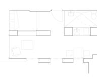
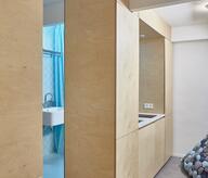
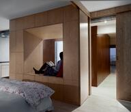
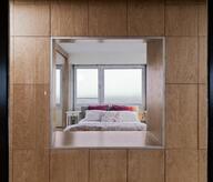
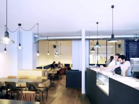
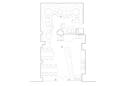
Restaurant designs in Paris are more often than not defined by a congestion of space, covered up in a more or less elegant layer of decoration. The Parisian dining experience is rarely relaxing, mostly dense, exposed and rushed. It’s hard to take a breather when there’s no air to breathe. This is even more true in the case of « burger joints » ruled by efficiency. Restaurant chain B&M, while retaining the functionality required for any restaurant, attempts at providing what might be the most valuable asset in Paris : abundance of space and the possibility to slow down, to read or engage a lasting conversation. For the first selling point, this vocabulary was applied by dividing the restaurant into two sub-spaces, dedicated respectively to the fleeting or the lasting dining experience. The front space is designed for optimal reception of clients. The oblique counter, both dynamic and functional, directs the flow of costumers. Once their order is complete, they can either proceed to the back space or turn around and exit with their purchase without having to make a way through the queuing crowd. When proceeding to the back, the atmosphere gets darker and quieter as we enter an introverted space. The defining element here is the bending bench seat, creating alcoves and nooks where one can be alone or in a large group. From the multiple sub-spaces, looks and glances cross the restaurant on all sides, making for a vibrant urban space.
- Typology
- Horeca
- Status
- Construit
- Year of conception
- 2012
- Year of delivery
- 2013
- Client
- B&M restaurant
- Total budget
- 45.000 €
- Per m² budget
- 450
- Constructed area
- 100 m2


